Here are some thoughts on researching and designing a service for expert users. These are specifically around designing a totally new service; one for which no users yet exist.
Usually when designing a service there’s a bank of knowledge of an existing system to draw from. Alternatively, there might be users of an existing service that we can iterate design ideas with. We didn’t have either of these, so we needed to think differently about how we could get user information, and how we’d design and test the service we were making.
These are my top tips to help you research and design for experts, especially when they don’t actually exist yet.
Who were the users and why didn’t they exist?
I was the UX researcher (and service designer) in an agile development team. By ‘expert users’, I mean we were designing for users who would be repeatedly using the same system over the course of a working day. They would process information for multiple end customers, who would call in by telephone. On average each user would be processing 50 – 100 customer calls each day.
The users didn’t exist because the service was part of a new giant call centre that was in the process of being set up. We needed to have the service in place for when the staff began their new jobs and the call centre was open, so we started designing and building before the staff had been recruited.
What was the service you were making?
The service was designed to let users take payments from customers. It replaced an old and cumbersome offline system, although it wasn’t a direct copy of the old one; it was updated to meet modern business requirements. See my previous blog post about working with Business Analysts (and Product Owners and Service Managers) to determine these business requirements.
Each customer call might require the user to perform a range of actions on the customer’s account. There was no single linear process that each user would be expected to perform.
So that’s a broad summary of what we were making. Here’s eight research and design tips we discovered through process:
Tip 1: Expect user requirements to change
We spent time with key stakeholders of different services and delivery teams, all of whom would have a hand in the service we were creating. We ran workshops to start to pin down some of the most concrete requirements. These were items that were more likely to stay constant over the course of the development. For example:
- What should this service do for the organisation?
- What outputs does it need to provide?
- Are there KPIs the service should provide data on?
- What other stakeholders do we need to speak to?
- What are the big blocks of the service that need to talk to each other?
These were the most concrete items at this point. We didn’t know what the service would look like from the user’s perspective, but we knew (roughly) what it needed to do. So we started to interview and meet with these stakeholders. It was like painting in big brush strokes to start with.
From this point, we started to create strawman user journey maps and work with the Solutions Architects to form service blueprints.
Eventually, these strawman service blueprints started to crystalize so that in each workshop stakeholders adjusted them less and less. Gradually, the requirements could start to be signed off. But even after multiple discussions these requirements continued to shift as one team discovered they needed a part of it to work differently, or that they wouldn’t be ready to provide certain data in time, which knocked on to other teams (including us).
We took a pragmatic approach, and acknowledged that while the skeleton of the service was solid, some of the ‘fleshy bits’ of the service were going to change.
However, in parallel to this service design with stakeholders from the organisation, we were also starting to bring in user data, to give us evidence that some of the user journeys needed to be in a particular form, and either couldn’t change or needed to. This helped us push back when requirements affected the user journey negatively.
Given that we didn’t have actual users yet, here’s how we went about getting that user data:
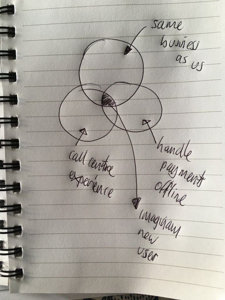
Tip 2: Requirements gathering: think Venn diagram
We knew we didn’t have any users from whom we could gather requirements. But we also knew there were some areas or ‘types’ of workers who did similar jobs.
- Some of these were in the same type of business, but didn’t handle telephone calls.
- Some of them handled payments, but didn’t work with computers.
- Some of them were experts at taking customer calls, and worked with computers to process the data.
Within these three areas was the sweet spot of the type of user we were building for. Here’s a sophisticated diagram (which I’ve been told might look a little rude) to explain this:
We spent time observing and side-sitting with representatives of these different types of user (we called them ‘tangential’ users), collating user needs and pain points of the existing services they performed. We built these pain points into an as-is customer journey map, so we knew what we needed to NOT create in any new service. We also tagged the needs of each of these different types, so we could refer back to them in future iterations.
These tangential interviews allowed us to start to sketch in what the core use cases would be for our imaginary users, and to start to define the ‘to be’ user journeys.
Tip 3: Don’t give experts what they ask for (necessarily)
Side-sitting with experts in their tangential fields (often people who’d done the same job for over 20 years) was eye opening. They had clear opinions of what worked and what didn’t work for them. They would often love to have a screen full of multiple complicated options and terminology in front of them, and they seemed to be the only people who could understand them. They were true experts – and they were proud of their mastery of their current system.
But we weren’t just building something for long-term experts to perform every conceivable task equally often. If we’d built a new service based on only their requests, we would have made something that would have required a lot of training for new staff to use. Yes, it would have been super slick and quick when they were up to speed, but it would not have been the simplest and easiest to use. It also wouldn’t have been built around the most frequent tasks they needed to do.
We were starting to gather data on the frequency of certain types of tasks, from our tangential users. So we took their feedback, and we used it in the design, but we didn’t give them back exactly what they asked for: we gave them a product that met business goals and surfaced the most common tasks most readily. We also avoided current pain points. Finally, we provided the opportunity to use short cuts for more complex, infrequent tasks.
Tip 4: Heuristics can be all you have
Even when we had a good idea of the requirements, the user journeys and the needs, we still had to start with a blank sheet of paper when designing. At that point, all we had were heuristics of design for expert users. I was surprised that there wasn’t more advice available on the web, but four articles really helped:
- Julie Søgaar’s piece about designing for expert users helped a lot. In particular, around getting the basics down, efficiency, speed, optimising for short-cuts and different data entry mechanics (e.g. keyboard tabbing, not just a mouse).
- The Nielsen Norman Group’s advice on observing and measuring user performance over time was useful, especially when planning usability testing (‘real’ end users were starting to be recruited by now, so we could test with them).
- Bruce Tognazzini’s article on removing clutter for expert users
- https://asktog.com/atc/the-third-user/
- In particular, this quote:
“It is our job to remove real clutter—any tools or data not needed right now—but it is not our jobs to hide what experienced users need just to make ourselves feel better when we look at their screens.”
Bruce Tognazzini – https://asktog.com/atc/the-third-user/
- We were working in a design environment constrained by design templates to support one quick transaction. E.g. As a [person] I want to [buy something] so that [I can be done as quickly as possible and never come back to this site]. This article by Laurian Vega gave us added confidence that we could step away from traditional ‘transactional’ design templates, and design for those multiple returning use cases that our users would do, every day.
So, thanks to all those nice people. 🙂
Particular heuristics that worked for us were:
- Design to reduce mouse clicks (although this is not the be-all-and-end-all)
- Assume experts won’t only use a mouse, and will tab to navigate around the screen
- Design to reduce the time it takes for a user to do a task
- Make sure the most important information is seen first (i.e. understand what the most important information is that the user should see and design for that)
- Design it to work within their wider environment – consider interruptions, what happens if a call drops, dual screens, and how information will be transferred between systems and screens by the user.
Tip 5: Embed a tangential expert in your team
As the user requirements came together, we ran design sprints to start to pull together screens and journey details. But design sprints were difficult to run, because everyone was busy and it was almost impossible get everyone in a room for enough time. We were lucky because one of the team had also worked in one of the tangential user roles before, so while we used the design sprints to carve away large lumps of stone from our service sculpture and start to form the broad shape, we could also get quick feedback from that team member on a rolling basis, to sand down some of the rough edges. This then fed back into regular large team catch-ups.
Tip 6: Be aware of your biases (as much as possible)
It was hard not to revert back to making a traditional one-linear-journey for each use case, rather than a ‘hub and spoke’ approach that the expert users needed. We were still thinking of each use case as a long-single route, just because we’d spent years working on them, or using them. But this was wrong, and having the embedded tangential user in the team helped to remind us this each time we looked like we were heading down that route.
Tip 7: Identify and optimise the subroutines first
The service we built allows users to perform a series of tasks for the customer when they call. But each of these tasks contains some sub-tasks, and those sub-tasks form little units of page sequences that need to be shown each time.
For example, if someone calls and wants to pay for something, the user has to search for that item in the system, select it, and confirm it. Then it gets added to the user’s account. That’s subroutine one, and it happens as one of the most common subroutines of screens.
Then the user needs to take the payment, so there are screens that allow the user to enter the amount the user wants to pay, confirm it and then take payment. This is subroutine two.
Within subroutine two, there’s also a mini subroutine where if a user has a discount on the thing they’re paying for, they can branch off and apply that, and then come back to the same place. This could be called subroutine 2a.
When we had these subroutines figured out, we concentrated on making each as quick and efficient as possible. Once we felt they worked, we stitched them back into one system, and worked out how to trigger each one from a call-to-action in the central ‘dashboard’ of the service. In the end, we realised we only needed two main core functions from the dashboard that would meeting most of the user needs, which helped keep the dashboard nice and tidy (and easier to use).
Tip 8: Evidence is everything
We were almost designing blind to start with, based on tangential users, opinions of what works best, heuristics, experience from working in other domains, and a bit of guesswork.
By the time we had some paper prototypes ready, the call centre staff were nearly in place, and some of the first recruits were already being trained up on the call centre processes. We were lucky as we could start to test our prototypes with them. If they weren’t available we would have had to go to our tangential experts for their feedback.
Paper prototyping and usability testing was where the real solid feedback came in and helped steer us towards the right first-release designs. We ran a series of iterative tests over weeks, to validate our designs.
However, because we were working with expert users we ran the tests in particular ways, to maximise ecological validity. For example:
- We tested in the environment the users would be working in.
- A very busy office. Plenty of noise and distractions
- Multiple monitors
- We familiarised new users with the system, giving them an introduction to the system so that they weren’t using it ‘cold’. We tried to replicate the fact that they would be familiar with it.
- We had a pool of users who had tested it before, so they were already familiar with it each time we arrived with a new iteration. Again, trying to replicate how they would use it for real.
- We gave users many repetitive tasks to do with the service
- We asked them to process a certain number of transactions as comfortably as they could, and noted:
- Time taken to process x items (of different types)
- ‘Mistakes’ made (that is, when they didn’t do something we expected them to)
- We administered a good old-fashioned Systems Usability Scale (https://www.usability.gov/how-to-and-tools/methods/system-usability-scale.html) questionnaire at the end of their session, so we could monitor how that changed over time as we made changes to the design.
- We videoed them working with the service, so that we could report back to stakeholders with compelling evidence if anything needed to be changed.
This evidence became crucial in persuading the team that we needed to make changes to the designs. However, we were pleasantly surprised that the end user testing worked pretty well. Hopefully this is testament to the processes we followed to get to that stage.
Summary
Overall, we created a service that did what the organisation wanted it to, and which met the needs of the experts, who didn’t exist at the start of the process.
If there’s one take-away I’d say, it’s to think around the edges of the problem. For example, if you can’t get what you need in order to get evidence, work out what you DO know to start with, and build on that with tangential evidence. Gradually pull the pieces together until you end up with something more solid. Find the most solid information you can and build from there.
I couldn’t find much information online when we started this process, so I hope this helps fill a gap for anyone else also building a service for experts (who don’t exist).
